Chelsea’s Cashew Creamery
UX research based website redesign
I helped out my community by creating a new website for a local favorite small business.
Business goals and objectives
After interviewing the owner, it became clear that the main reason people go to the website is to learn more about the products and specific ingredients in order to decide if the shop is worth visiting. The main goal of the website was to drive in-store purchases. (Later on, with the addition of online ordering through the website and in-store pickup, this will also include driving online sales.)
Who is the user?
Going through the business plan and talking to the owners, there was 4 target customers defined and I used this information to paint a clear picture for myself about the user. I combined these target customers into 2 user personas.
ANALYTICS - Key findings:
Most people find the site by searching “ice cream” or “ice cream near me”, but still most people find the site by direct search. They mainly use a mobile phone.
The most visited page after the homepage is “Our Ice Cream” which suggests that the menu is there, but it is instead an explanation of the process and ingredients. They don’t spend much time here before they go back to the homepage. They probably expect to find the menu there and they didn’t scroll down on the homepage before they clicked away.
Many people request directions to the shop from the site (looking on mobile phone).
More than half of the visitors exit the site after the homepage (it has the most information).
“Newsletter” signup page is the least visited page, suggests weak CTA.
What problem is the website trying to solve?
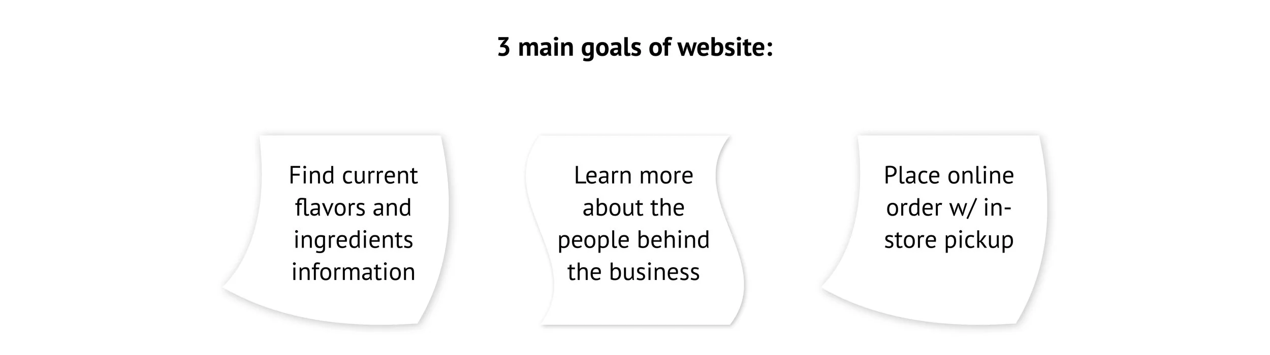
Based on the user personas and the business goals, I worked on defining the main pain points the website is trying to solve. According to the stakeholders, the main reason people visit the website is to look at the menu, the allergen information and to know more about the people behind the business. Later on, the goal of the website will also include online ordering. After brainstorming about all the possible website functions, I developed these 3 user journeys.
At this point I also created a storyboard to further investigate how the customer interaction would happen and how the business solves customer problems.
Competitor analysis and heuristic markup
I examined 3 competitors’ websites and focused my analysis on the 3 pain points our website is trying to solve, to see what they did. Also looked at the visual esthetics of the competitor websites and how is it in line with their brand.
After examining the competitors, I performed a “heuristic markup” (by Leah Buley: The User Experience Team of One) to see how the current website measures up to solving the pain points I found. I also followed the 10 heuristics in user interaction defined by Jacob Nielsen. (I followed 2 user journeys, since online ordering is not available yet.) I also quickly visualized the current content of the website in a content audit diagram:
Creating the Information Architecture
With the result of the UX audit I did a closed card sorting exercise based on the available content to get closer to drafting the IA of the new website. Working closely with key stakeholders, the sitemap was iterated until the final website structure emerged.
Wireframes
Based on the sitemap, I moved on to creating the wireframes while keeping in touch daily with stakeholders, making sure that all content and functions are correctly placed before starting on developing the prototype. I learned how to advocate for the user and explain my ideas as well as how to listen to client needs and finding compromise.
Since based on the user research, most people visit the site on mobile, I simultaneously designed for mobile and web, with the mobile layout taking preference.
Prototype
The prototype was designed based on the final wireframes and the brand identity. I first created a moodboard to capture the brand style and started a UI library that would grow with the prototype.
The prototype was created in about 2 weeks, with close collaboration and daily communication with the stakeholders. I captured a before and after to show the visual transformation of the site.
I also went through multiple versions of UI elements and visual solutions for the new design.
Conclusions and Learnings
Overall the client was very satisfied with the final result. If I had more time for this project, I would have also designed in-between pages, like a 404 page or a screen for loading information etc. I also didn’t have an opportunity to conduct early user interviews with an early-stage prototype, however I would try to create an environment where that is possible in my next projects. The measure of success for the new design will be increased traffic to the website and increased foot-traffic into the store.
“We are so appreciative of all the work you put in this project and you did a great job of capturing the look and feel of our brand.”